Identity created for ORDER CHAOS interdisciplinary studio. The identity focuses on the way we express ourselves. The expression is shown by experimentation with various techniques. By combining these techniques their strengths and weaknesses start working together. The +=x-/ signs which are used throughout the entire identity are used to reinforce this idea and represent the various ways of interaction. The typographic logo is dynamic and will always be connected by one of the mathematical signs, the content will always be shown in the in-between that is created by the placing of these elements. Every element in the identity is treated as a blank canvas that contains different forms of expression. The identity is accompanied by a series of posters which show the nature of ORDER CHAOS studio: experimental, inquisitive and versatile.


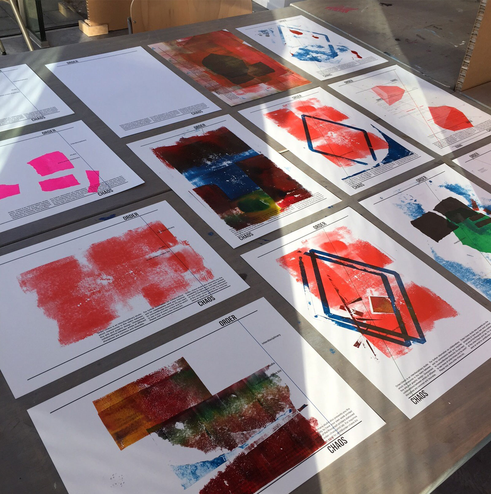
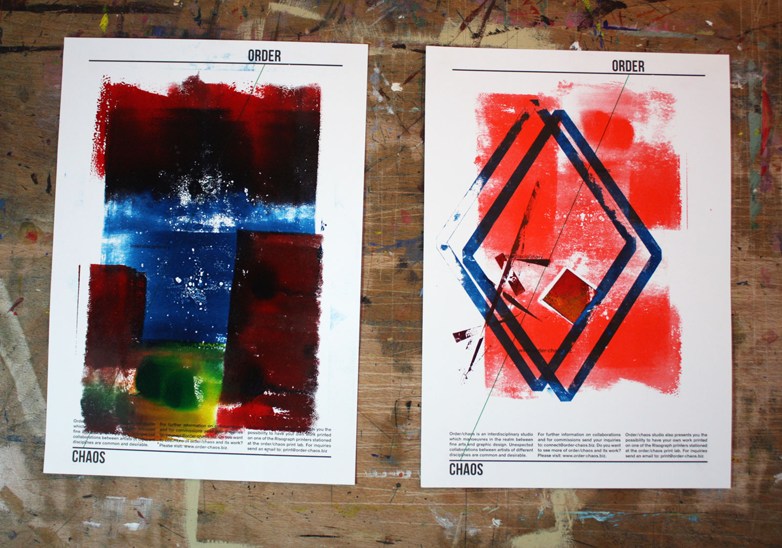
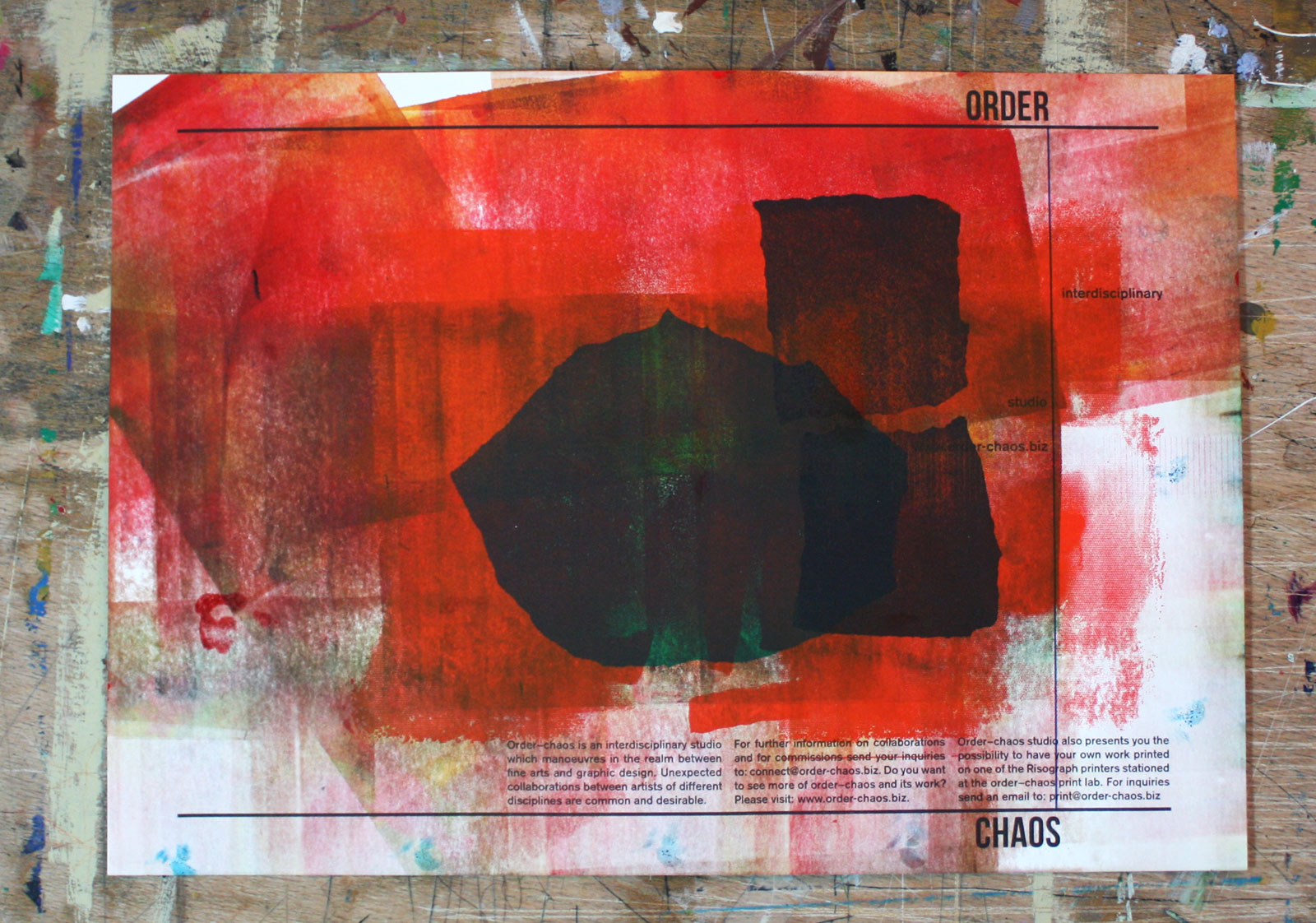
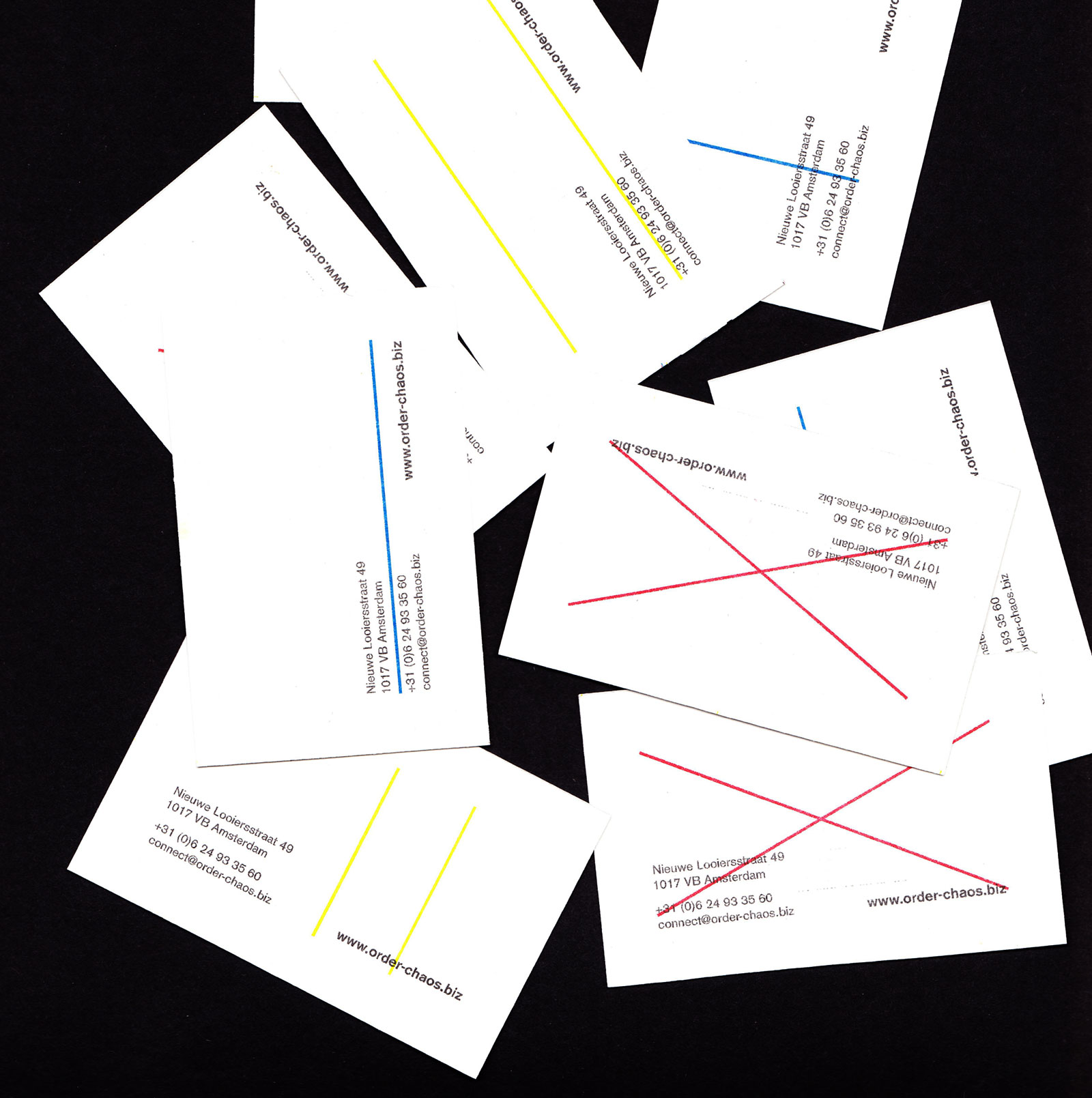
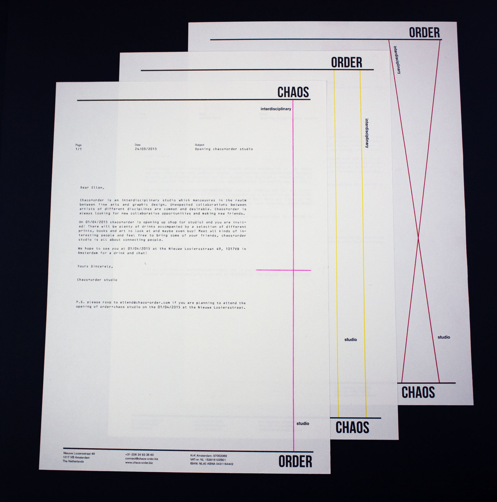
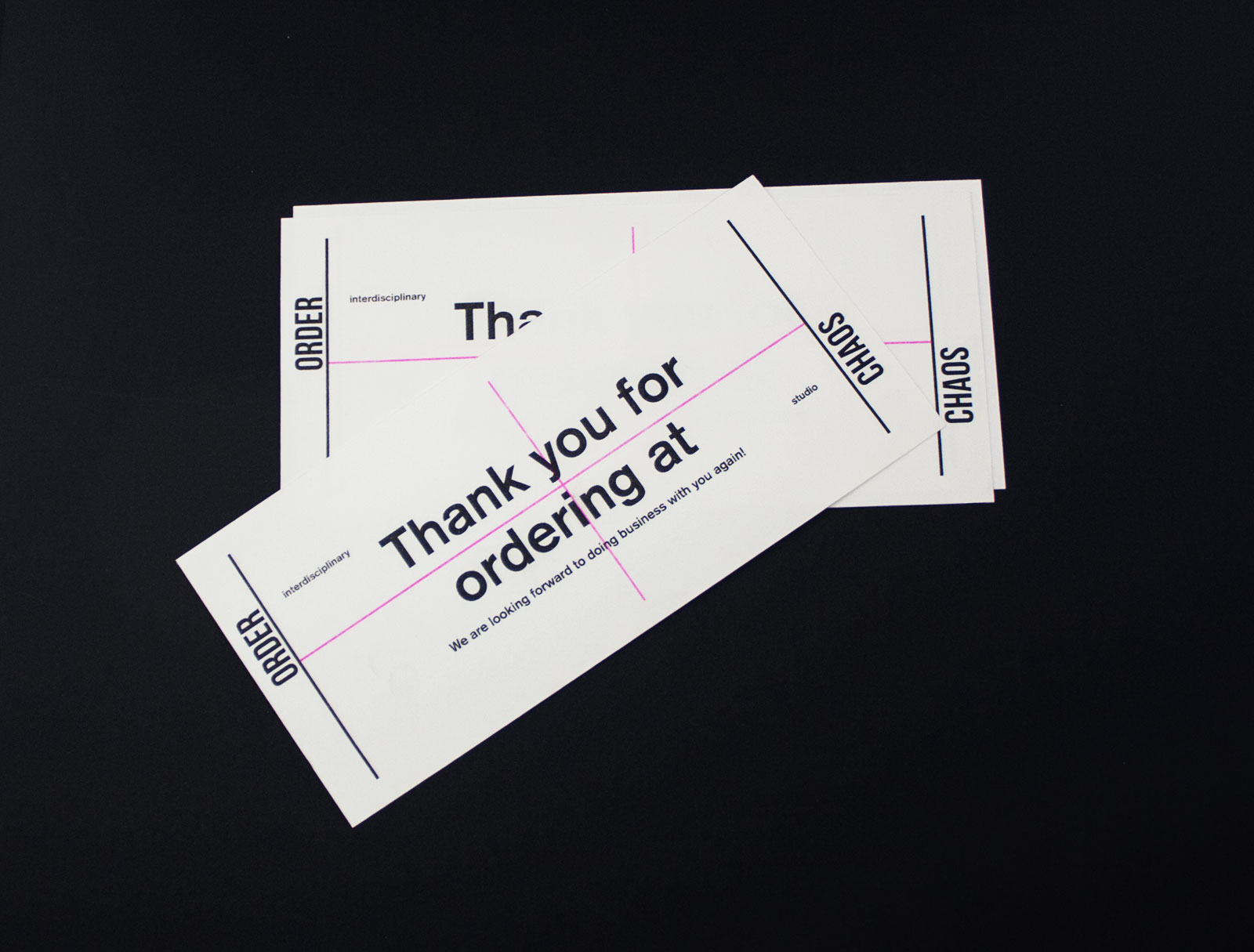
The identity was printed at the ORDER CHAOS printlab on the Risograph EZ370e. Six colors were used: black, red, yellow, blue, green and fluor pink. For the posters shown below several other techniques were used, including monoprint, screen print and collage. The posters are a means to express the nature of the studio by using and combining all kinds of techniques and showcasing their combined strength or perhaps, their weaknesses.